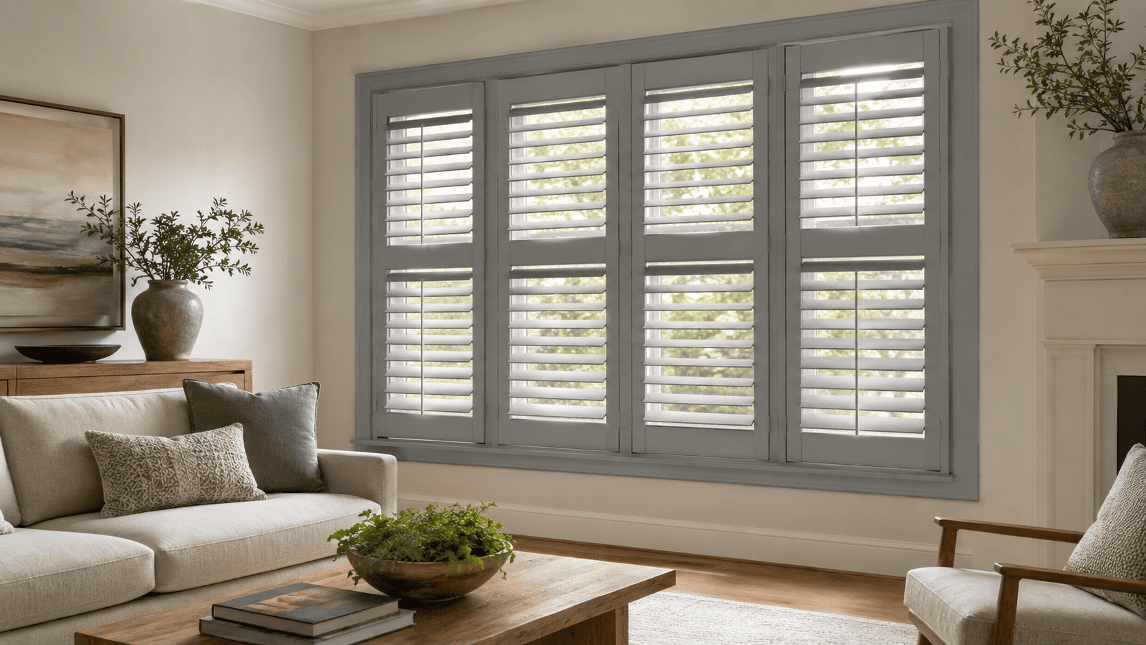
Gray Window Shutters: When a Soft Neutral Works Best
Author: Nigel Harris
September 2, 2026.
Gray window shutters offer a softer alternative when white feels too bright and black creates more contrast than your room needs. Depending on the shade and undertone, gray can blend quietly into the surrounding palette or give the window subtle definition.
This versatility makes gray especially useful in cooler interiors, transitional rooms, and spaces that combine warm and cool finishes. The right gray can connect painted walls, natural wood, stone, metal, and upholstered furniture without making the window feel visually heavy.
However, not every gray works in every room. Lighting, undertones, trim color, window size, and the finishes already present in your space all influence whether gray interior shutters will look balanced and intentional.
Why Gray Window Shutters Create a Softer Contrast
White shutters often blend with light trim and create a bright, crisp frame around the glass. Black shutters sit at the opposite end of the spectrum, producing a stronger architectural statement.
Gray occupies the space between them. It can define the window without introducing the sharp contrast of a very dark finish. This makes it a practical choice when you want your shutters to feel noticeable but not dominant.
Light and medium grays can also soften transitions between different surfaces. For example, gray shutters may connect cool white walls with a stone fireplace, stainless steel details, muted upholstery, or weathered wood flooring.
The result can feel especially cohesive in rooms that do not follow a strictly warm or cool color palette.
Choosing the Right Undertone for Gray Interior Shutters
The word “gray” covers a broad range of colors. Two samples may look similar on their own but create very different results once placed beside your walls, trim, flooring, and furniture.
Before selecting a finish, identify whether the gray has a cool, warm, or relatively balanced undertone.
Cool Gray Shutters
Cool gray usually contains subtle blue, green, or violet undertones. These shades often work well with:
Cool white or blue-white walls
Charcoal and slate finishes
Blue, navy, or green accents
Chrome, brushed nickel, or stainless steel details
Concrete-inspired surfaces
Cool-toned stone or tile
A cool gray can give the window a clean, contemporary appearance. It may be particularly effective when choosing modern shutters for a room with simple lines and a restrained color palette.
Be cautious when placing a blue-based gray beside creamy trim or strongly yellow wood. The contrast between the undertones can make both colors appear more pronounced.
Warm Gray and Greige Shutters
Warm gray contains beige, taupe, or brown undertones. It is sometimes described as greige when the balance between gray and beige is especially noticeable.
These shades can coordinate with:
Cream or off-white walls
Natural oak and medium-toned wood
Beige, camel, or taupe upholstery
Brass or bronze details
Warm stone and textured surfaces
Transitional or rustic interiors
Warm gray is often easier to introduce into a room with mixed materials because it can bridge cooler architectural finishes and warmer furniture.
Balanced Neutral Gray
A more balanced gray does not lean strongly blue or beige. This can make it adaptable, but the surrounding colors will still affect how it appears.
A neutral gray may look cooler beside cream walls and warmer beside blue walls. Comparing the finish inside the room is therefore more reliable than choosing it under store or screen lighting.
Read also:
Cafe Style Shutters Guide for Street-Level Privacy
Shutters for Doors: French Doors, Sliding Doors & Patio Doors
Where Gray Shutters for Windows Work Best
Gray can suit many spaces, but it is particularly effective where the room already contains muted colors, mixed finishes, or moderate contrast.
The following settings give gray shutters a clear role within the overall design.
Living Rooms With Mixed Materials
Living rooms often combine several surfaces, such as painted walls, wood furniture, stone, metal, rugs, and upholstered seating. Gray shutters can create a visual connection between these materials without matching only one of them.
A warm gray may coordinate with natural wood and beige upholstery, while a cooler gray may echo stone, metal, or blue accents.
On a large window, the shutter color becomes a meaningful part of the room. Consider how it will look both when the louvers are closed and when natural light moves through them.
Bedrooms With a Calm, Layered Palette
Soft gray shutters can support a quieter bedroom design without disappearing completely into the walls. They work particularly well with muted blues, soft greens, off-whites, natural wood, and tonal bedding.
Lighter grays usually keep the room feeling open, while a medium gray creates more definition around the window.
Because color can look different in morning and evening light, evaluate how the finish responds throughout the day rather than relying on a single viewing.
Home Offices With Cooler Finishes
Gray shutters can complement the structured look of a home office, particularly when the room includes cool whites, dark furniture, metal details, or a restrained palette.
The louvers let you adjust daylight and reduce distracting glare while maintaining a clean architectural finish around the window. A gray frame can also feel less stark than bright white behind a desk or computer screen.
Kitchens, Bathrooms, and Utility Spaces
Gray can coordinate naturally with stone counters, tile, metal fixtures, and painted cabinetry. In spaces where humidity or condensation may be present, color should be considered alongside the shutter material.
Ask about moisture-resistant options suited to the room rather than choosing according to appearance alone. The selected gray should also be compared with permanent surfaces, such as tile and countertops, which are less likely to change than paint or accessories.
Coordinating Gray Shutters With Walls, Trim, and Flooring
Gray shutters do not need to match another surface exactly. In many rooms, a coordinated difference creates a more considered result than an imperfect color match.
Use the following elements to guide your decision:
Wall color: A slightly darker gray can outline a pale wall, while a similar tonal value creates a quieter transition.
Window trim: Decide whether the shutters should blend with the trim or appear as a separate architectural layer.
Flooring: Wood, stone, and tile can reveal whether the room leans warm or cool.
Fixed finishes: Compare the gray with countertops, fireplaces, cabinetry, and built-in features.
Furniture and textiles: Use these elements to confirm the palette, but avoid matching the shutters to one temporary accessory.
Hardware and lighting: Black, brass, nickel, and bronze details can influence how warm or cool the gray appears.
When exploring different shutter colors and finishes, prioritize the surfaces that will remain in the room for the longest time.
How Natural Light Changes the Appearance of Gray
Gray is particularly responsive to changes in light. A shade that looks neutral in one room may appear noticeably blue, green, beige, or violet in another.
Window direction, outdoor surroundings, wall color, and artificial lighting all influence the result.
Bright, Sun-Filled Rooms
Strong daylight can make gray appear lighter and may reduce the visibility of subtle undertones. In a bright room, a medium gray can provide definition without creating the visual weight of black shutters.
Sunlight reflected from landscaping, neighboring buildings, or painted exterior surfaces may also affect how the color appears near the window.
North-Facing or Dimmer Rooms
Cooler or limited daylight can make blue-based grays feel colder. In these settings, a warmer gray or greige may create a more comfortable balance.
Very dark gray shutters can also make a small or dim window feel more enclosed. A lighter finish may be more suitable when preserving an open appearance is the priority.
Rooms With Several Windows
When the same shutter finish is repeated across several windows, its visual impact increases. A gray that feels subtle on one sample may become a major part of the room once applied to a full wall of windows.
Look at the entire elevation rather than evaluating each opening separately. Panel divisions, frame profiles, and surrounding wall space will all affect the final balance.
Design Details That Influence the Finished Look
Color is only one part of the shutter design. Proportion, panel configuration, frame style, and louver size determine whether the installation feels clean and tailored.
These details should support the gray finish rather than compete with it.
Louver Size
Larger louvers usually create broader, simpler horizontal lines. They can suit contemporary rooms and help reduce the number of visual divisions across a large window.
Smaller louvers introduce more repeated detail and may feel appropriate in traditional rooms or smaller openings.
The right size depends on the window dimensions, the view, and the overall style you want to create.
Frame and Panel Layout
A well-proportioned frame gives gray shutters a deliberate architectural presence. The frame should meet the surrounding trim cleanly and avoid awkward transitions around the opening.
The number and width of the panels also matter. Too many narrow panels can make the design appear busy, particularly in a medium or dark gray.
Your design consultant can help determine whether an inside mount or outside mount is more suitable based on window depth, trim, handles, and the amount of surrounding wall space.
Painted Finish and Surface Detail
A smooth gray finish creates a more uniform appearance and often suits clean, tailored interiors. A finish with visible wood character introduces natural variation and may feel warmer or more traditional.
Exact colors and finishes may vary, so compare the available options with the permanent materials in your room before making a final decision.
Read more:
Large Window Shutters: How to Keep Wide Openings Balanced
Shutters for Small Windows: Design Ideas That Make a Big Impact
Gray Shutters Compared With White and Black
Understanding the visual role of each neutral can make the decision clearer.
White window shutters generally create the brightest effect and often blend naturally with white window trim.
Gray shutters soften the contrast while still giving the opening definition.
Black shutters create a bold, graphic frame and tend to become a stronger focal point.
Choose white when you want the shutters to feel bright and closely connected to the trim. Choose black when the room needs a deliberate architectural statement.
Gray works best between those two outcomes. It gives the window presence without requiring the strongest possible contrast.
When Gray May Not Be the Best Choice
Gray is versatile, but it should still support the specific palette and lighting conditions of your room.
Consider another finish when:
The room contains strongly warm colors that make the selected gray look unexpectedly blue.
You need the shutters to blend seamlessly with bright white trim.
A dark gray would add too much visual weight to a small or poorly lit opening.
The room already contains several unrelated gray undertones.
You are choosing the color primarily because it is currently popular rather than because it suits the permanent finishes.
A sample should be evaluated as part of the whole room, not as an isolated color.
Create a Softer, More Tailored Window Finish
Gray window shutters can bring definition to a window while maintaining a calm, flexible palette. The most successful result comes from selecting a gray that relates to your walls, trim, flooring, fixed finishes, and natural light.
Custom interior shutters also allow the color to work alongside appropriate panel proportions, louver sizes, frames, and mounting details. These elements help the finished installation look integrated with the architecture rather than added as a separate decorative feature.
During an in-home consultation, a design consultant can help you compare available gray finishes in your own lighting, evaluate the window, and identify a configuration suited to the room. This gives you a clearer understanding of how the color and shutter design will work together before your order is placed.