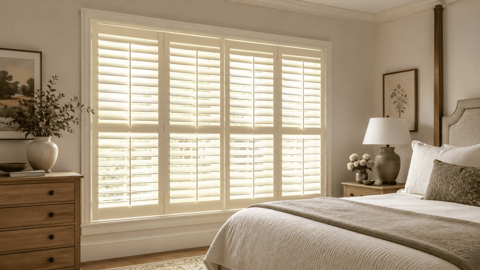
Cream Window Shutters: A Warmer Alternative to Bright White
Author: Nigel Harris
September 2, 2026.
Cream window shutters offer a softer alternative when bright white feels too crisp or creates more contrast than your room needs. They still provide a clean, neutral frame around the window, but their warmer undertone can connect more naturally with wood flooring, warm paint colors, stone surfaces, and layered neutral interiors.
The difference between cream and white may appear subtle on a small sample. Across a full window, however, that difference becomes much more noticeable. The right cream can make the shutters feel integrated with the room, while the wrong undertone may look yellow, dull, or disconnected from the surrounding trim.
Before choosing cream interior shutters, consider the room’s existing colors, the direction of natural light, and how the finish will relate to nearby architectural details.
Why Choose Cream Window Shutters Instead of Bright White?
Bright white creates a crisp, defined outline around a window. That can work beautifully in interiors with cool whites, sharp contrasts, or a clean contemporary palette. In warmer rooms, however, it may stand apart from the rest of the design.
Cream window shutters reduce that contrast without losing the tailored appearance that makes shutters feel architectural. Because cream contains a small amount of warmth, it can create a smoother transition between the window and materials such as beige walls, natural wood, warm gray flooring, or softly colored cabinetry.
Compared with white window shutters, a cream finish may feel:
Softer against warm or mixed-neutral walls
More connected to natural materials
Less stark in rooms with gentle natural light
Better suited to traditional or transitional details
Warmer without becoming a strong accent color
Cream is still a light neutral, so it does not need to make the window feel heavy. The goal is simply to replace a sharp white contrast with a quieter, more cohesive result.
When Cream Interior Shutters Work Best
Cream is versatile, but it feels most intentional when its warmth is supported by other elements in the room. Look beyond the wall color and consider the complete palette surrounding the window.
Rooms With Warm Neutral Walls
Cream interior shutters tend to coordinate naturally with ivory, oatmeal, beige, mushroom, taupe, and warm greige walls. These colors share some degree of yellow, red, or brown undertone, allowing the shutters to relate to the wall without disappearing completely.
The finish does not have to match the wall exactly. A small amount of contrast can help define the window while maintaining a soft overall palette.
Interiors With Natural Wood Tones
Natural wood floors, furniture, ceiling beams, and cabinetry often introduce warmth even when the walls are relatively neutral. Cream shutters can bridge these wood tones with the lighter surfaces in the room.
This is especially useful when bright white looks disconnected from oak, walnut, or other warm-grained materials. Cream creates a visual transition rather than placing a stark white frame beside them.
Traditional and Transitional Rooms
Cream works well with detailed trim, paneled walls, classic furniture, and other traditional elements. It can also suit transitional interiors that combine classic architecture with cleaner furniture and simplified decoration.
The finish itself does not determine whether the shutters appear traditional. Frame profile, panel proportions, and louver size also influence the final style. A restrained cream paired with uncluttered details can look current rather than old-fashioned.
Mixed-Tone Color Schemes
Some rooms contain both warm and cool elements. You may have gray walls alongside a warm wood floor, for example, or white trim near beige stone.
In these situations, a balanced off-white can act as a bridge. Look for a cream that has noticeable warmth without appearing strongly yellow. This allows it to coordinate with warmer materials while remaining comfortable beside cooler neutrals.
Read also:
Choosing Shutter Colors & Finishes: White, Stained Wood & Painted Options
Rustic Window Shutters: How to Create a Warm, Character-Filled Interior
How to Keep Off White Shutters From Looking Dated
The concern with off white shutters is usually not the color category itself. The problem is more often an undertone that is too yellow, a near-match that looks accidental, or a finish that has no relationship to the rest of the room.
A few design decisions can keep the result clean and deliberate.
Choose a Restrained Cream Undertone
Cream can range from almost-white to noticeably buttery. For a versatile result, begin with a light, restrained cream rather than the strongest warm option.
A subtle undertone is easier to coordinate with future paint colors and furnishings. It also maintains more of the fresh appearance associated with white while reducing its sharpness.
Compare the Finish With Fixed Surfaces
Paint and furnishings can change, but flooring, stone, built-in cabinetry, and architectural trim are usually more permanent. Use these fixed elements as the foundation for your color decision.
A cream that coordinates with the floor or stone veining may remain suitable even after the room is redecorated. By contrast, selecting the finish around one temporary accessory can make the shutters harder to integrate later.
Repeat the Warmth Elsewhere in the Room
Cream shutters feel more intentional when a similar tone appears somewhere else in the space. It does not need to be an exact match. Warmth may be repeated through a wall color, upholstery, natural wood, artwork, cabinetry, or stone.
This visual repetition shows that the cream was chosen as part of the palette rather than as an isolated substitute for white.
Keep the Shutter Design Visually Clean
Simple panel divisions, balanced proportions, and an appropriate frame can prevent cream from feeling overly traditional. This is particularly important when you want modern shutters but find pure white too cold for the room.
The finish and the shutter configuration should work together. A soft color can still create a contemporary result when the surrounding lines are clean and purposeful.
Should Cream Shutters Match White Window Trim?
Cream shutters do not always need to match the trim, but the relationship between the two finishes should look deliberate.
There are three practical approaches:
Match or closely coordinate the shutters and trim: This creates a unified architectural frame and minimizes visible color transitions.
Use cream shutters with clearly white trim: The contrast can work when both colors connect to other parts of the room and the difference is easy to recognize.
Coordinate the shutters with the wall instead of the trim: This can soften the window and reduce contrast, particularly in rooms with warm neutral walls.
The most difficult combination is often an almost-match. When the shutters and trim are only slightly different, the result may appear as though one finish has faded or was selected incorrectly.
Place samples directly beside the trim rather than comparing them from opposite sides of the room. Check the combination in daylight and after the room’s lights are turned on.
How Natural and Artificial Light Affect Cream Shutters
Color temperature changes throughout the day, which means the same cream can look different from morning to evening. The window’s orientation, exterior surroundings, and artificial lighting all affect how the finish is perceived.
Cooler or Shaded Light
North-facing windows and heavily shaded rooms often receive cooler light. In these conditions, a cream finish may appear more neutral or slightly grayer than expected.
A small amount of warmth can help keep the shutters from looking flat, but an overly muted off-white may appear dull in a room that already receives limited light.
Strong Warm Sunlight
South- and west-facing rooms may receive warmer or more intense sunlight. This can emphasize yellow, peach, or beige undertones in a cream finish.
A balanced cream with less obvious yellow may be more successful in these rooms. Review the sample during the brightest part of the day, not only in the morning or under indoor lighting.
Evening Lighting
Warm light bulbs can intensify the warmth of cream shutters, while cooler bulbs may make the same finish appear closer to neutral white. Check the sample using the lighting you normally use in the room.
This is particularly important in bedrooms, dining spaces, and living room shutters, where the appearance after sunset may matter as much as the daytime result.
Using Cream Window Shutters in Different Rooms
Cream can create a different effect depending on the room and the materials surrounding the window.
Living Rooms
In a living room, cream shutters can soften the transition between the window and warm furniture, flooring, or wall colors. They are particularly effective when you want the window to look finished without becoming a high-contrast focal point.
Because living rooms often contain several materials and neutral shades, a balanced cream can help connect the complete palette.
Bedrooms
Cream can create a calm, comfortable frame around a bedroom window. It works well with soft neutrals, muted colors, and natural wood furniture, particularly when brilliant white feels too energetic against the room’s quieter palette.
You can still adjust the louvers for privacy and light control, so choosing a warmer finish does not mean giving up everyday functionality.
Kitchens and Dining Areas
In kitchens and dining rooms, compare cream shutters carefully with cabinetry, countertops, flooring, and trim. These rooms often contain several different whites and neutrals, making undertone coordination especially important.
Cream can complement warm cabinetry or stone, but it may appear mismatched next to a very cool white surface. Viewing samples beside each major finish will help identify whether the difference looks complementary or unintentional.
Hallways and Open-Plan Spaces
Windows in connected spaces need to relate to more than one room. A restrained cream can be useful when the surrounding areas contain a combination of white, beige, warm gray, and wood.
For visual consistency, consider whether the same shutter finish should continue across the connected windows or whether each room has enough separation to support a different choice.
Read more:
Stained Shutters vs Painted Shutters: Which Finish Is Right for Your Home?
Wood Window Shutters: What to Know About Grain, Finish, and Room Fit
Shutter Details That Influence the Final Color Effect
Color is only one part of the design. The proportions and installation details can make cream window shutters look subtle or visually prominent.
Larger louvers tend to create fewer horizontal lines and may give the window a more streamlined appearance. Smaller louvers introduce more detail and can support a classic look. Panel divisions also affect how much visual structure appears across the opening.
The frame and mounting approach matter as well. Choosing an inside mount or outside mount changes how the shutter relates to the surrounding trim and wall. An inside mount may allow decorative casing to remain visible, while an outside mount creates a stronger frame around the opening.
These details should be considered together. A cream finish that looks understated on a sample can become more noticeable when used with a wider frame or multiple panels.
Questions to Ask Before Selecting Off White Shutters
Before making a final color decision, review the room as a whole rather than focusing only on the window.
Ask yourself:
Does the cream share an undertone with the wall, flooring, cabinetry, or stone?
Does it look intentionally different from the window trim?
How does the finish change during the day?
Does it remain balanced under the room’s evening lighting?
Will the color work if the walls or furnishings change later?
Do the frame, panel layout, and louver proportions support the style you want?
Should nearby rooms use the same finish for consistency?
These questions can help you evaluate cream as part of a long-term interior palette rather than as a trend-driven color choice.
Create a Softer, More Intentional Window Design
Cream window shutters can provide the clean structure of white with a warmer and more relaxed visual effect. They work particularly well when bright white feels disconnected from the room’s walls, wood tones, cabinetry, or natural materials.
The most successful finish will not necessarily be the warmest cream or the closest match to the trim. It will be the option that looks balanced in the room’s real lighting and connects naturally with its permanent surfaces.
During an in-home design consultation, your design consultant can place finish samples beside the walls, trim, flooring, and other nearby materials. They can also measure the opening and help you select the frame, panel configuration, and other details for your custom interior window shutters. Installation details can then be coordinated as part of the overall project experience.